Brand in use/ Style guide
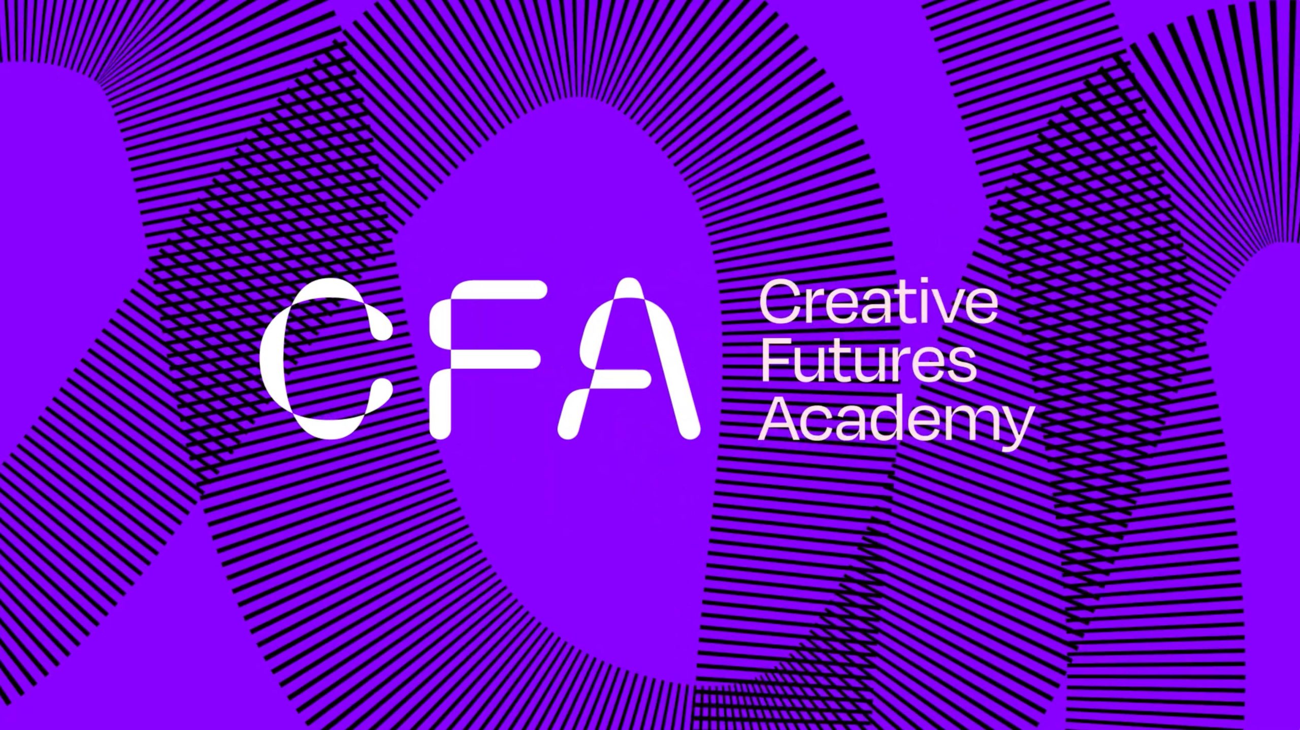
The journey is full of potential, we can be dynamic and expressive with it. Using it large, we create a fresh new visual language for CFA. Celebrate our flexibility and creativity. There’s no limit to what can be done. Go for it.
Experiment with its form and scale. Is there a new way you can apply it, position it, repeat it, or use it to represent an idea? Play with colour and pattern or images within it. Explore, experiment.
Posters
Using the brand elements in a restrained manner, with clear typographic hierarchy (Link) creates functional and engaging documents.
Download
Google Drive
Download
Google Drive
Stationery
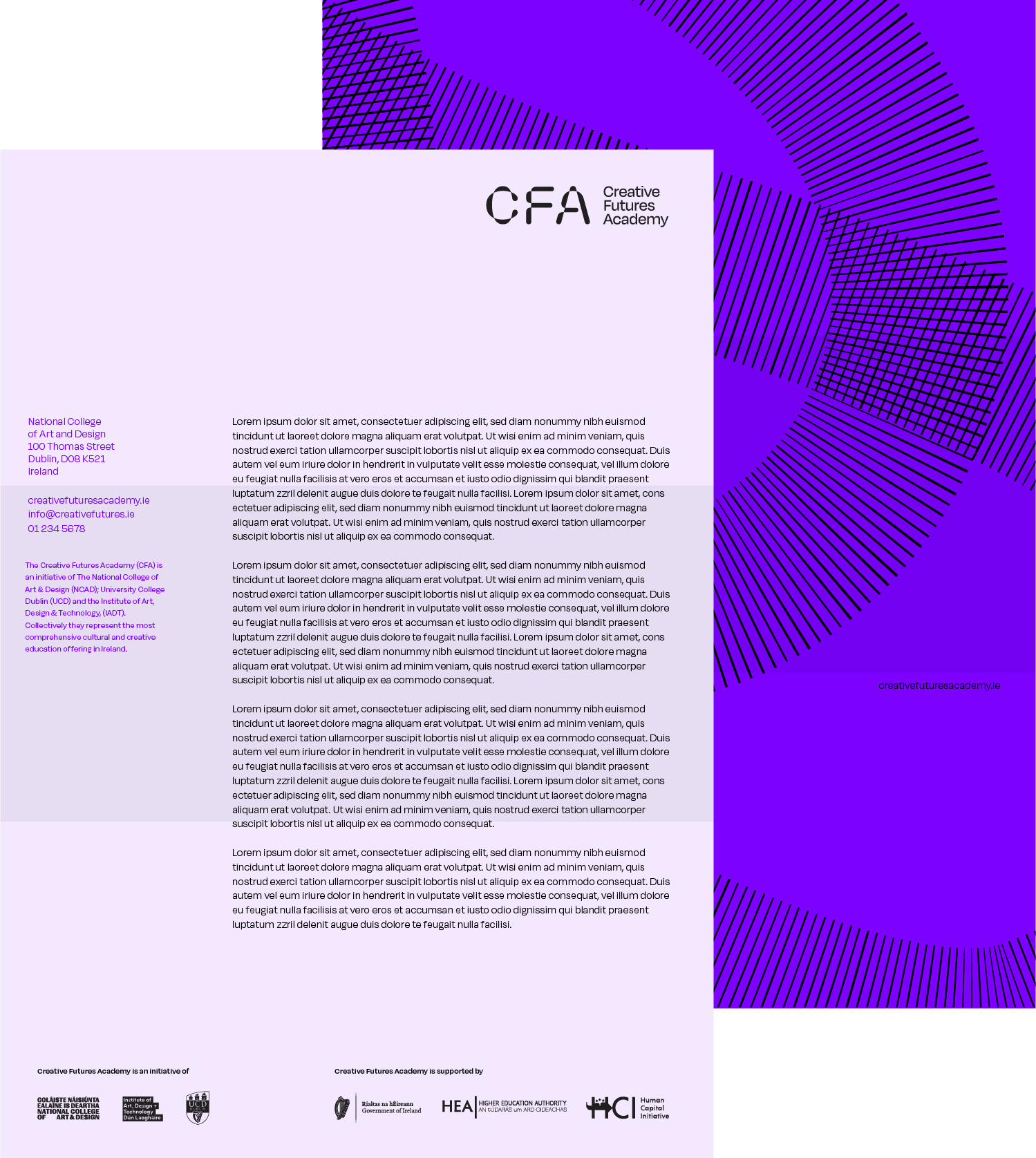
A template for letterheads and business cards is available, these should be order centrally in larger batches.
Print specification
Letterhead to be printed colour both sides on 100gsm recycled stock. Business cards are matt foil blocked on duplexed 540gsm purple and ebony Colorplan.
Download
Google Drive

Social media
Social media is an integral part of our commuincations strategy, as such it should be designed to an appropriate standard using the brand elements.
A blend of graphic, photography and compelling language should be combined to avoid repetition. The style of posts should cycle through a range of templates to maintain engagement, establishing brand recognition over time. Here are a few examples of potential instagram posts.
When creating images for social media, make sure you have the current dimensions for the platform your are creating for. (check here)
As space is at at premium, it is not possible to include partner and funder logos, however it is essential that they are appropriately tagged in all posts. @myiadt
Approved Hashtags –
- #creativefuturesacademy
- #ShapeYourFuture
- #CreativeFutures
- #TheFutureIsCreative
- #DesignYourWorld
Profile pictures /Avatars
Social media profile pictures and avatars are available for all common platforms.
Cover photos
Cover photos are available for all common platforms.
The Website
Imagery
Avoid using graphic designed material, ie. flyers or posters for feature images, as they will clutter the site and compete with the text content. Photography and/or graphic patterns without text are much better suited to this role. Ensure the pattern blocks you select have sufficient contrast to allow the white text to be read easily.
Writing
Consider the amount of text you are uploading and how much the viewer will want to read online. Think about how relevant the title is, and consider the length of the title, best practice is to keep it simple and to the point. Use introductory paragraphs and periodic headings throughout to help add pace to the content.
Video
Titles and lower thirds
A selection of opening and end frames have been designed, containing the correct logos in the appropriate position.
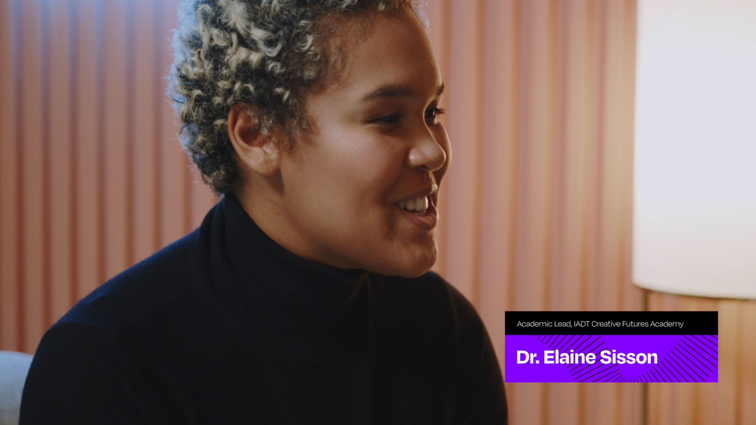
Lower third graphics have also been designed. Two options are available, one to suit shorter names, and one for longer names and titles.
After Effects files for the above are available for download, which allows for editing of text.
CFA logo / Top & Tail Animations
CFA logo animations have been designed to be used as top & tail segments of videos. Bilingual and animations for use with specific educational partners have also been designed.
Signage
Signage should include the full logo and the journey as a background.
Stands
Standard size pull-up stand templates are available in the Dropbox.


